
Simplicity
Keep It Simple Stupid
In 1931, Harry Beck was a young engineer who was working as a draftsman in the London Underground Signals Office, without any permanent contract. In his free time, Harry came up with a new diagram for the Tube. When he finally showed his superiors his work, they were skeptical about his radical proposal.
After that cool reception among his bosses, the map was eventually published in 1933, inside a pamphlet, of which only a few copies were distributed. The new design quickly became popular. Just one month later, the pamphlet was sent back to the printer’s—this time for a huge print run. Harry received 5.25 pounds in payment, which was equivalent to two weeks of work for him.
Up until that time, the London Underground map, like other subway maps, was superimposed on a topographic representation of the city. Riders could see the contour of the city and the distances between tube stations, since they were represented graphically.
Harry believed that travelling customers were more interested in knowing how to get from one station to another and about the existing connections than in knowing the exact distance between stations. Inspired by the electrical circuits he used to work with, Harry created a diagram, not a map: horizontal lines, vertical lines, and other lines with 45 degree slopes. Now the stations were separated by the same distance, regardless of their geographic separation. Connections between stations were easily recognizable. The new map also included bright colors for each of the tube lines. Johnston typeface emphasized the modernity of his composition. With this new diagram, realism was lost, but representativeness was gained. Harry’s work offers complex but essential information, without getting passengers tangled up in unnecessary indications. Today, I want to talk about simplicity in design.
As Little design as possible
The most direct way to make a product simple is to reduce its functionality. In the not-so-distant past, search engines were full of options and links. Then Google appeared, with its magnificent white page and its search box. Nothing would ever be the same again. We believe Google was brave with its design. Actually, the simplicity of its page had more to do with coincidence. Sergey Brin didn’t know HTML, which was why they used the minimal code so that the search engine would work. It wasn’t minimalism—it was necessity.
Good design is as little design as possible – Less, but better – because it concentrates on the essential aspects, and the products are not burdened with non-essentials. Back to purity, back to simplicity.
Dieter Rams
We want our products to be user friendly, but it’s hard for us to deny our users functionalities. For John Maeda, the first step consists of removing all functionality, provided that it doesn’t make you lose the feeling of value in the product.
Maeda advocates the SHE method: Shrink, Hide, Embody.
Shrink. Small devices appear simpler to us. Unconsciously, we have low expectations for the abilities of small apparatuses. Nowadays—thanks to technology—that is a misperception. But, we can use this mistaken perception to maintain an illusion of simplicity regarding our products.
Hide. Hide your product’s least-used functions. Make it so that these little-used options are optional.
Embody. After shrinking and hiding, it is necessary that our product increase the sense of perceived value. Maeda recommends polishing our product’s shapes, finishes, and materials as much as possible. Try looking for the screws on your new, cutting-edge iPhone 5; run your fingers over its surfaces, and you will understand the term “Embody”.
Make your product understandable
Organization makes a system of many appear fewer.
John Maeda
Design is nothing more than order that emerges from chaos. We humans tend to classify our experiences in such a way that they seem regular, orderly, symmetrical, and simple to us. Order brings about a better understanding of our products—and this better understanding results in a perceived simplicity.
If I were only able to learn about one thing in the world of design, I would ask that this be the Gestalt principles. The Gestalt principles are the rules by which our perception is organized.
Why is it important to understand our perception? Thanks to this knowledge, we can control the way our objects are perceived, and we convey their internal organization, and thus we help focus users’ attention more effectively.
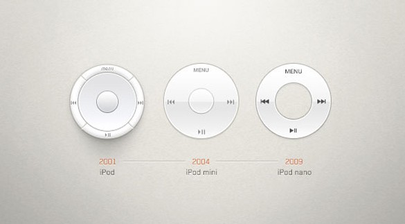
Organization—like design—is a process. A lot of work and testing is needed before achieving truly simple and efficient organization. For example, in the first version of the iPod, the control buttons surrounded the center of the dial. In the second version, the four buttons were separated from the dial and placed in a horizontal line on the top part. The final simplification was integration of the dial and the menu options.
Source: xooplate
Save users time they will feel like simplicity
Reducing waiting times in a process is reducing a user’s feeling of frustration. For the task of ordering a meal at McDonald´s, the wait time is the critical point. With more time, consumers would surely be able to prepare a better product, but they get a good product in record time. Therefore, there is the perception that we are dealing with a simple process. Reducing the time a task takes simplifies the perception about this task—but eliminating waiting times from the process is even more important.
Houston airport was receiving a high number of complaints about waiting times at baggage claim. In response, executives increased the number of baggage handlers. The plan worked, and the average wait time was cut to eight minutes, which is considered acceptable within the industry. But the complaints continued.
The airport’s managers conducted a more thorough analysis and found that the time travelers took from when they got off the plane to when they arrived at baggage claim was one minute. The rest of the time—seven minutes on average—was spent waiting to collect their luggage.
Solution: the airport decided to reduce wait times. How? By extending the time from when passengers got off the plane to when they arrived at baggage claim. Passengers now had to walk six minutes more through the airport’s halls. Customer complaints disappeared.
Simplicity is about subtracting the obvious, and adding the meaningful.
John Maeda
Follow @NoamMorrissey Tweet