Neighborhood
Won't You Be My Neighbor?
Originally published in Linkedin on July 10, 2018
When he got home, Fred Rogers would change from his work clothes into something more comfortable, replacing his shoes with sneakers and his suit jacket for a cardigan knitted by his mother… always one knitted by his mother. Fred died in 2003, but his cardigan is housed in “The National Museum of American History“, also known as the “The Smithsonian“. Very few objects in the museum invoke more affection than this humble cardigan.
For more than thirty years, Fred Rogers was the neighbor that every child wished for. In his kids’ TV show, “Mister Rogers’ Neighborhood” he tirelessly looked after the moral and emotional wellbeing of children aged between two and six years. For millions of Americans, Fred represents the best of human values: respect, compassion, integrity and humility.
The language he used was direct and clear enough to be understood by children; each and every one of his words measured and thought out. For Fred, the language that we use to speak to children determines the way that they are able to control their emotions. Fred’s program started back in the 1960s, a time of great upheaval for American Society: war, racial conflict, and rampant criminality. His program helped children to understand the way to deal with situations that were as emotionally complex as murder, divorce and suicide – there was even a special episode the day after 9-11 – all thanks to a language that was thought out just for them.
Fred measured each word used in his episodes in an obsessive way; his biggest worry was that his words would be misinterpreted. For example, every episode ended with the song “Tomorrow,” in which he would say goodbye to his audience until the following day. The words of the song were the same everyday except for Friday, when the words changed so that the children would not expect to see in on Saturday, when his show wasn’t on.
What is a design system?
A design system is the language that is created and shared within a product team. This language is composed of mutually interconnected and reusable patterns. A system design ensures that the whole is better than the sum of its parts. Unlike other products, such as a style guide, a design system is constantly evolving. Its final objective is to ensure that a product remains coherent as its complexity increases.
When we create a design system, we are creating a common language that allows people from different teams to work together on a project as complex and evolving as a digital product. It is not a design language, it is the language of different teams, it is a language that allows the expression of opinions to make business, design or development decisions.
We don’t draw a button, we explain how it works, how to use it, the reason why we have this button in particular, its name, its status, what its literal path should be like…Every aspect of a component and what surrounds it, should be thought through, profiled and polished over and over again. Just like Fred and his team did.
Speaking in “Freddish”
So much care was taken in the process of creating Fred and the show’s content that they created the term “Freddish“. “Freddish” was a system of steps taken to translate normal language into an unambiguous language designed for communicating with children.
- “State the idea you wish to express as clearly as possible, and in terms preschoolers can understand.” Example: It is dangerous to play in the street.
- “Rephrase in a positive manner,” as in It is good to play where it is safe.
- “Rephrase the idea, bearing in mind that preschoolers cannot yet make subtle distinctions and need to be redirected to authorities they trust.” As in, “Ask your parents where it is safe to play.”
- “Rephrase your idea to eliminate all elements that could be considered prescriptive, directive, or instructive.” In the example, that’d mean getting rid of “ask”: Your parents will tell you where it is safe to play.
- “Rephrase any element that suggests certainty.” That’d be “will”: Your parents can tell you where it is safe to play.
- “Rephrase your idea to eliminate any element that may not apply to all children.” Not all children know their parents, so: Your favorite grown-ups can tell you where it is safe to play.
- “Add a simple motivational idea that gives preschoolers a reason to follow your advice.” Perhaps: Your favorite grown-ups can tell you where it is safe to play. It is good to listen to them.
- “Rephrase your new statement, repeating the first step.” “Good” represents a value judgment, so: Your favorite grown-ups can tell you where it is safe to play. It is important to try to listen to them.
- “Rephrase your idea a final time, relating it to some phase of development a preschooler can understand.” Maybe: Your favorite grown-ups can tell you where it is safe to play. It is important to try to listen to them, and listening is an important part of growing.
Our Freddish
Our languages do not use words to put together messages, but they do have patterns of design. A pattern is a replicable solution to a repeated problem. When we design, we make predictions about the user’s mental models in the aim that our solutions will be understood intuitively. We usually use previously implemented solutions, and the collection of these implementations is what we call a design standard or pattern. We don’t usually use new patterns for a standard problem, as then the user would have to learn how to use them.
A design pattern is the continued and combined use of the different components that make up an interface. These components include interactions to sounds, buttons, colors, typefaces, movement, tone of communications, etc. The objective of a design system is to be capable of defining or identifying these patterns so that they can be registered, documented and shared as a common language.
Patterns do not restrict creativity, nor do they make a website boring. Two products created to resolve the same problem should not differentiate themselves through the use of different functional patterns, if these are the right ones, but in the way these patterns have been applied to each product.
There are three types of patterns that are especially important: functional, product and platform patterns. Functional patterns are those elements of our language that focus on the user’s tasks within our interface, for example, in Spotify you can find playback controls, search tools, flows and interactions that allow you to create a “playlist”, etc.
The product patterns are the elements of our language that we use to define our product’s brand: the choice of typeface, colors, sizes, the tone that we use in our communication, movement, icons and illustrations. Product patterns combined with functions are what determine the product’s perception of solidity and trustworthiness, which impact on the brand perception.
A great way of generating your own design system is to show how these three patterns are defined and share them with the rest of the team. To give an example in “Freddish”… When defining the color pattern of our system, we should make a distinction between the functional and the product patterns. On one hand, we have the colors that are part of the identity of the brand that we are working with, and on the other hand, the interface colors that we use to communicate functional actions within the system.
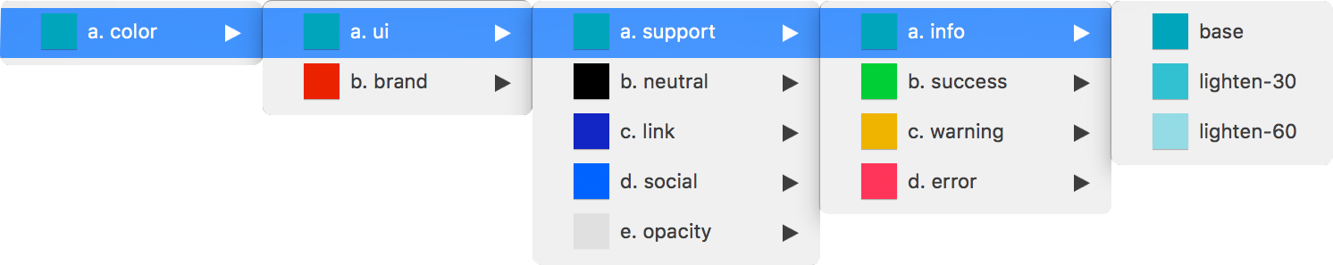
An example of color within the functional pattern.
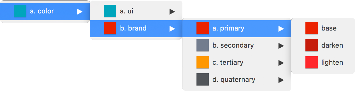
An example of color within the product pattern.
These two patterns are not isolated and the sum of the two is what makes the system work, but when we express the metaphorical we gain control over the system by making the interconnected elements visible to the whole product team. Just as “Freddish” does, we make the language incontrovertible, creating common knowledge.
To continue with the example, in our language, created alongside development, freedom is given to the product pattern but the same does not occur for the functional pattern. There is freedom to choose any colors for the brand; they are values that are simply selected by the designers.
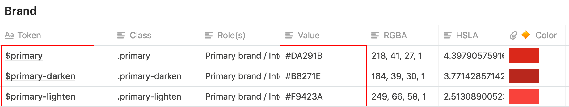
But the color values used in the functional pattern are established according to construction rules that help logical development when these values are created.
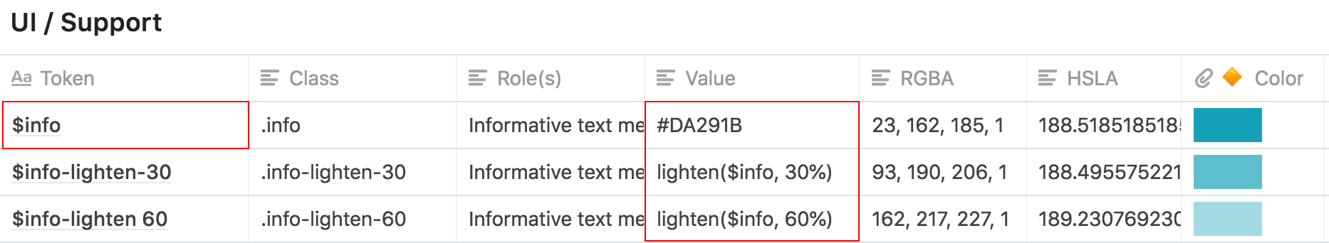
A button is a call to action and this call is saved in the functional pattern, whereas its color, font and shape qualify the product and are found in the product pattern. The way of showing these patterns to the development team is to transmit to them that the functional pattern is HTML, whereas the product pattern is our CSS.
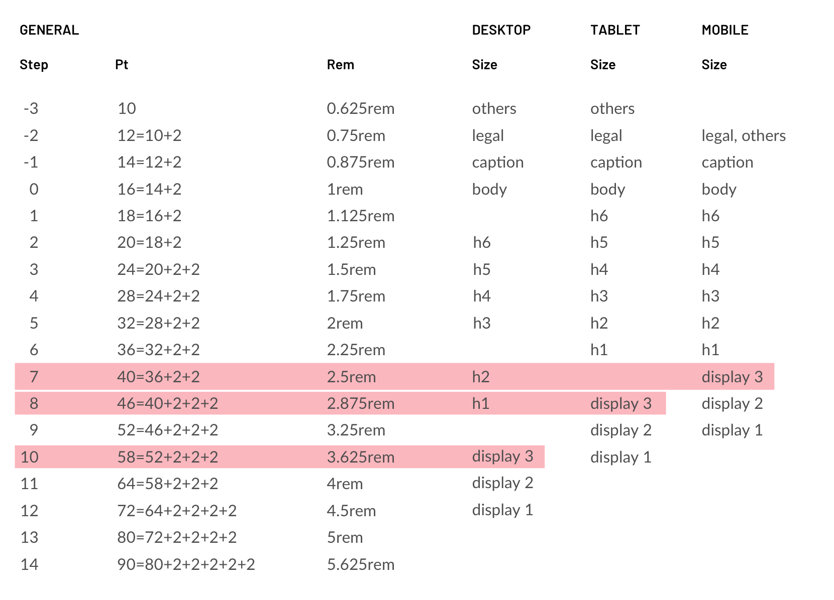
And finally, we have the platform pattern. The same product can exist across different technological platforms: Web, Android, iOS or other devices. Each of these platforms and devices has its own elements of language that have to interrelate to the function and product patterns, in order to offer a unitary experience to the user.
To give an example in “Freddish“, when we define the typefaces to be used in our language, we need to reflect not only a series of sizes, but we also associate them with a brand and a device, a decision that was made hand-in-hand with development. This image illustrates how “display 3“, among others, changes its value depending on the type of device that we are designing for.
We only generate a design system when we detect patterns, use multidisciplinary creation and document all the decisions made in an exhaustive manner. In the search for a common language, the tools and the way of designing change. It can appear obsessive, over-the-top, a waste of time, but our “Freddish” is the only way to communicate with certainty between all the product teams. It is a way of acting with respect, integrity and humility towards our colleagues and users.
Follow @NoamMorrissey Tweet